The company decided to go digital and engage with their audience through additional channels – online broadcasting and a news portal. My role was to design the website and establish a new brand identity.
Platform
Web
Services provided
- Web design
- Brand identity
Year
2016-2017
Link
Visit website01.
Research & ideation
Although there were not many requirements from the customer side (apart from creating awesomeness) there was one big constraint. The company asked to have the project up & running in less than 3 months! This included design, development, testing and new content creation. A tight schedule with no much space for experimentation. Above anything, the most important goals were:
- Offer quick access to LIVE broadcasting
- Create a space for talk show archives & podcasts
- Combine the two above with news articles into a nicely organised news portal

First sketches
With no further hesitation, I jumped straight into research. I conducted a competitor analysis to better understand the landscape and for design inspiration. The analysis involved a variety of different local news portals, including international ones.
To help conceptualise the project I sketched on paper some of the ideas that came to my mind during research. The artefacts helped a lot in the discussions with the stakeholders. Although the customer was very opinionated and started to ask for “nice to have, but not important at all” features, the development team had to push back most of ideas in order to make sure the project was delivered in time. This gave me a better understanding of what areas need more or less attention.
Wireframes
After a bunch of sketching and brainstorming sessions I started creating wireframes mainly to communicate the navigation and screen interactions.
The navigation was rather simple, and although by then most of stakeholders had some sort of understanding from previous sketches, the wireframes helped formalise it and have everyone on the same page. This also helped the development team prepare the skeleton of the pages.
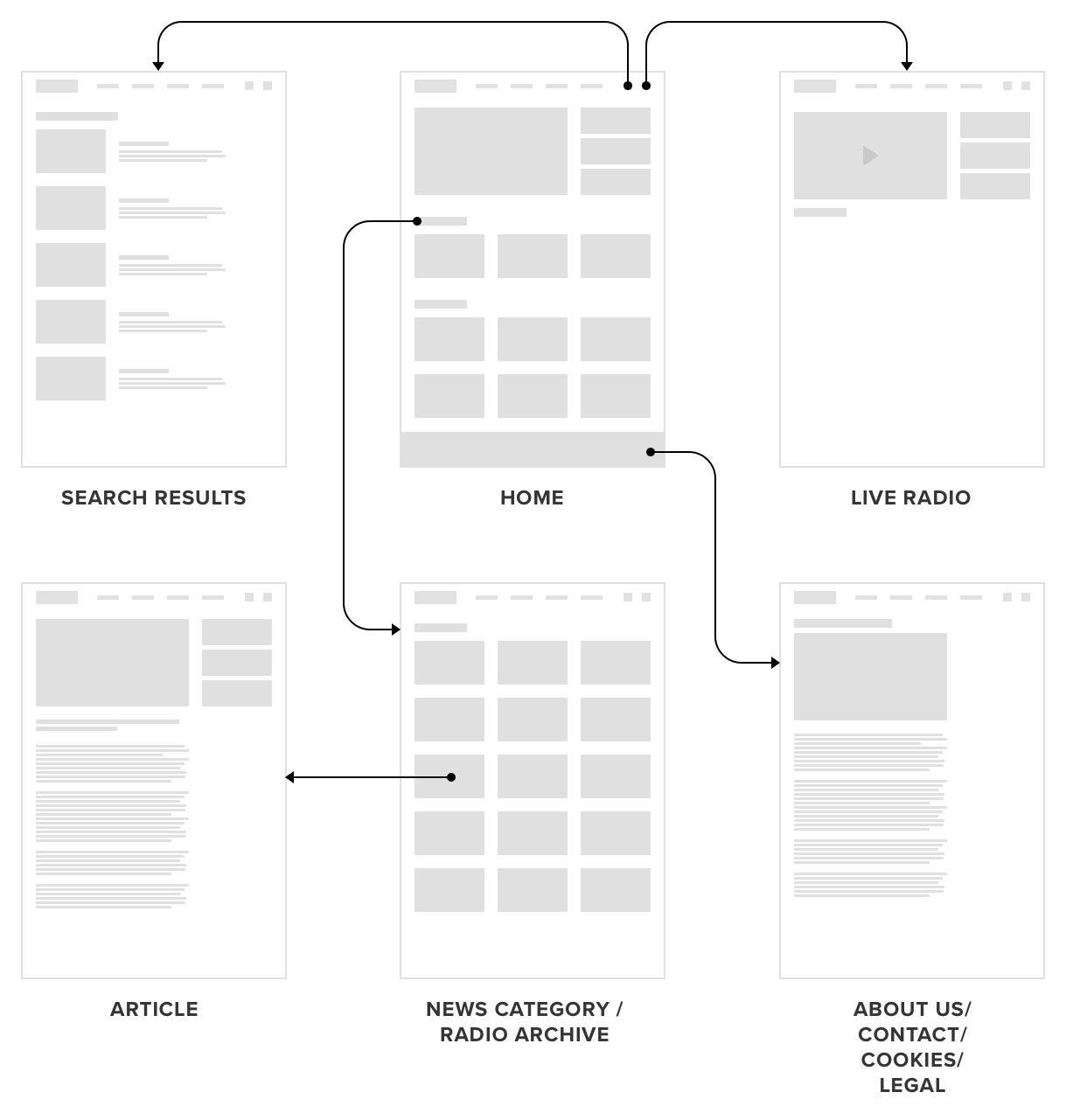
Main page
A vast amount of time was was spent on tweaking the news areas on the home page. Given that this is the first interaction point with the brand, the company requested to offer a diverse choice of news from all categories, filtered by options like: Featured news, top news of the day, latest news published, etc.

02.
Identity
Parallel to the work on the website’s structure, I started ideating on the identity. The company asked me to create a modern, bold identity adapted for the digital space, but which would blend in some traditional elements inspired from the rural imagery of Moldova: blue sky, vineyard hills, golden fields and dusky sunsets.


Photo credits: Maxim Chumash
Initial concepts
The company requested to avoid any radio representation or any associations with the sensitive past of the name Vocea Basarabiei (English: The Voice of Bessarabia). The initials VB served as a starting point.
Final logo
After some iterations, we agreed on a classical sans-serif letterform of the B and a quotation mark replacing the second line of the letter V.

Colors & Typography
Bunting
#171958
Dark gray
#535353
Fuel Yellow
#F2AF29
White
#FFFFF
Montserrat Semi-bold 600
Aa
A Ă Â B C D E F G H I Î J K L M N O P Q R S Ș T Ț U V W X Y Z
a ă â b c d e f g h i î j k l m n o p q r s ș t ț u v w x y z
Noto Serif Regular 400
Aa
A Ă Â B C D E F G H I Î J K L M N O P Q R S Ș T Ț U V W X Y Z
a ă â b c d e f g h i î j k l m n o p q r s ș t ț u v w x y z
03.
Visual design
When most of the structure and navigation was covered, I started working on the aesthetics. The UI was heavily inspired by Microsoft’s Metro Design Language: clean, bold, geometrical. This played really well with the logo.
Even from the beginning a big emphasis was placed on images and content. This become more obvious with the increase in fidelity and colours popping up. After some iterations with visuals in Sketch, the customer was finally happy with the visual design aesthetic. See the final result below.
For more screens, check InVision:


