What does it take to redesign a familiar, decade-old interface without losing players’ trust?
Short answer: examine player behavior and address the challenges they encounter. Get comfortable and let me guide you through this redesign journey.
Platform
Web Desktop
Web Tablet
Web Mobile
Activities
Research
Prototyping
User testing
Visual Design
Year
2017
LINK
I.
Intro
What is PlayUI?
“PlayUI” is the replacement for the in-game interface layer. This layer serves 90% of the video slot games produced at NetEnt. Unlike its predecessor, PlayUI is designed to be modular and flexible so that it could serve the needs of different market requirements.
What problem are you solving?
The purpose of the new solution is to fix issues of the old interface:
- Cash values are obscured by coin-denominated values
- High-maintenance costs (for both, updates and new features)
- Stiff layout which is no longer adaptable to the growing number of requirements for market compliance
- Clunky and outdated
What was your role & contributions?
Initial phase
- Planned and conducted discovery exercises;
- Designed mobile layout.
After the first iteration
- Took on the role of the sole designer and made all design decisions;
- Redesigned the main desktop layout;
- Redesigned the betting;
The work I am presenting below represents my initial research and later-stage contributions. You can get a glimpse of the old design, the first iteration, and my redesign.
Old
First iteration

My contribution
Design Challenges
- Keep the familiar NetEnt butterfly shape which is an iconic element of NetEnt games.
- Ensure a gradual transition from coin-denominated bets to cash betting.
- Raw layout. No styling or skinning.
Design Principles
Increase awareness by improving transparency
Provide players with transparent and concise information about their balance, bet size and earnings by displaying it clearly on every screen or state.
Less is more
Manage complexity - highlight the essentials by disclosing secondary or advanced features progressively.
Be inclusive and versatile
Consider the diversity of languages and currencies of existing and future markets. Adapt accordingly.
Design for the unexpected
Any component should be easily rearranged, removed or added to meet different market compliance requirements.
Enable customization
Gaming is fun. Game designers should have the flexibility of skinning according to the game's theme and incorporate game specific features without any hassels.
II.
Discovery
To gain a deeper understanding of the weaknesses of the existing product, our team made use of 4 research methods. Observations and insights from these exercises are presented in the next chapter.
Stakeholders interview
Being a newcomer in the industry, I organized 1-on-1 formal interviews with Game Product Owners from NetEnt. Who could have a better understanding of players than the creators of games themselves? Through stakeholder interviews, I was able to gather insights into the existing design decision, as well as key user demographics and use cases.
Heuristic Evaluation
As a part of the exploration/research process, myself and two other UX designers from the company conducted a heuristic evaluation of the previous interface using Jakob Nielsen’s 10 usability heuristics and Gerhardt-Powals’ cognitive engineering principles. After individually reviewing the old interface, we discussed our findings. Our assessment of the old product through established heuristics and principles allowed us to determine the most critical usability problems and proposed potential solutions.
Eye-tracking game sessions
For this study, we invited five participants who play online slots at least once a month. The study was divided into two parts. In the first part, we asked the participants to play a game for 5 minutes, just as they would typically do during their free time. The purpose of this was to check the frequency of their visual engagement with each element of the interface. In the second part, we gave them tasks that involved interacting with the UI and observed their gaze paths while measuring completion time.
Eye-tracking game sessions provided us with rich data on how users interact with the product and where they focus their attention.
Online survey
To validate our early assumptions, we set up an online survey targeting players who regularly play NetEnt games and are familiar with our brand. Given that NetEnt is a B2B2C company, we had limited exposure to players. However, we were lucky to have our customers (Casinos) send and collect answers for us. The survey was structured to differentiate between types of players (personas). We asked participants key questions, which included:
1) Betting preferences
2) Ranking the importance of all game features (such as Autoplay, Max Bet, Quick Spin, Paytable, and others) based on their own usage
3) Evaluation of the ease of use of existing game features.
The online survey helped us collect quantitative data on user preferences and back our assumptions.
III.
Define & Design
As a result of all the discovery exercises, we identified and grouped issues into 4 major areas of improvement. We formalized them as observations and created an assumption for each of them.
It’s worth noting that the learning process wasn’t linear. The decision to do a redesign came after receiving feedback from the Game Product Owner and from another eye-tracking game session, following the first iteration.
.1
NetEnt Butterfly — the transition to icons
Observation
Upon analyzing survey data, we discovered a surprising trend in players’ preferred functionalities. While Autoplay remained popular, Max Bet was replaced by Quick Spin as the second-most used feature.
Assumption
In light of expanding language support, a switch to an icon-based interface was deemed necessary. As a key element of the UI, the iconic “butterfly” buttons from NetEnt underwent a long-awaited upgrade.
Before
The “butterfly” set of buttons would display the feature name on each wing/side, resulting in a potentially awkward appearance, particularly when translated into languages other than English.


Old
After
Autoplay was kept on the left wing as before, whilst the right-wing Max Bet was replaced with the Quick Spin functionality. Although the average slot player is familiar with the default features, we added tooltips on hover for novice players to alleviate any doubts they might have regarding the purpose of any icon.


Redesigned
.2
Fields consolidation and the purge of double denomination
Observation
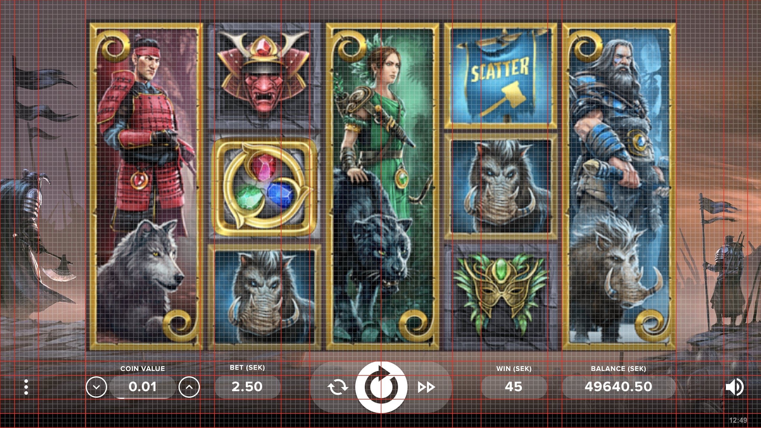
Data from eye-tracking tests show that the majority of players look at the bottom part of the screen every time before they proceed to spin and after winning presentations. The bottom area of the UI is where the Balance, Bet and Win values denominated in the player’s currency are located.
Assumption
Currency-denominated values are more relevant than coin ones. Simplifying the interface by removing coin-related fields, such as LEVEL and COINS, will lead to a more efficient experience for players, as it eliminates confusion and provides them with only one denomination.
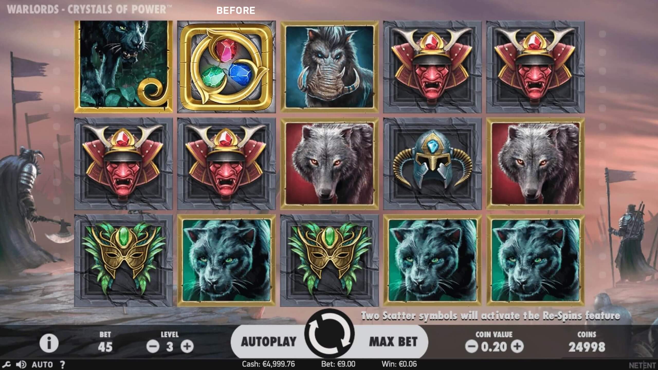
Before
Balance, Win and BET values are denominated in coins and in player’s currency and simultaneously displayed in the UI.

Old
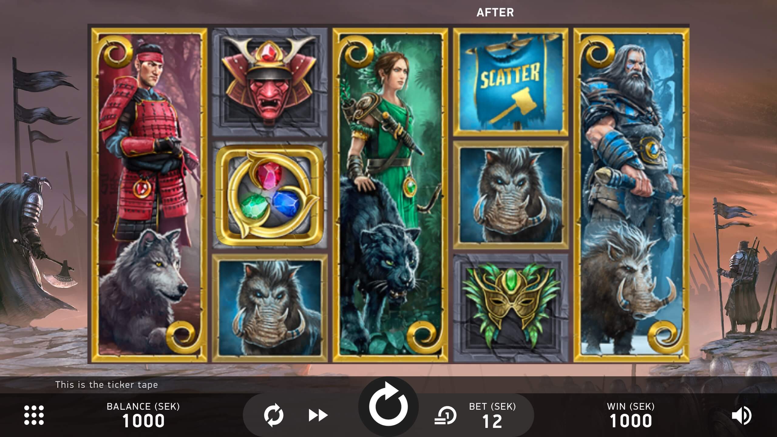
After
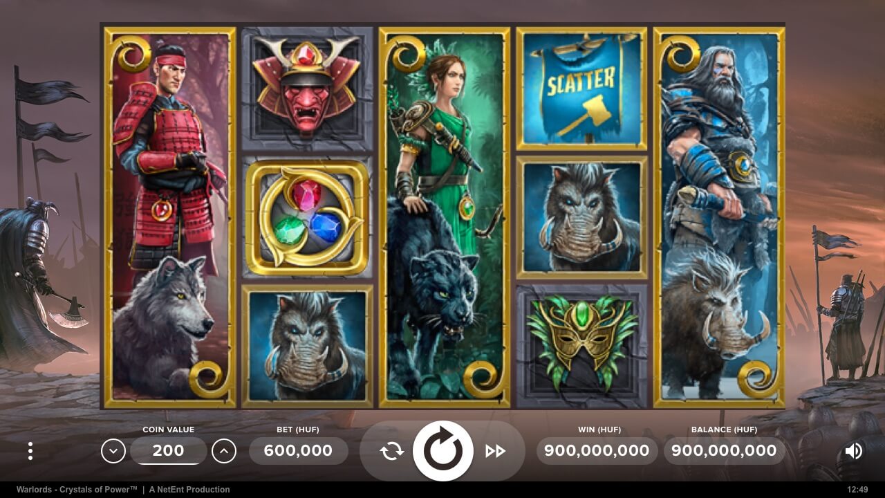
Balance, Win, and Bet values are only displayed in ONE denomination (player’s choice of currency as by default). This resulted in the following:
- The merger of Coins with Cash under the Balance field;
- The merger of Bet (coins) with Bet (currency) under the Bet field;
- Elimination of Level field.

Redesigned
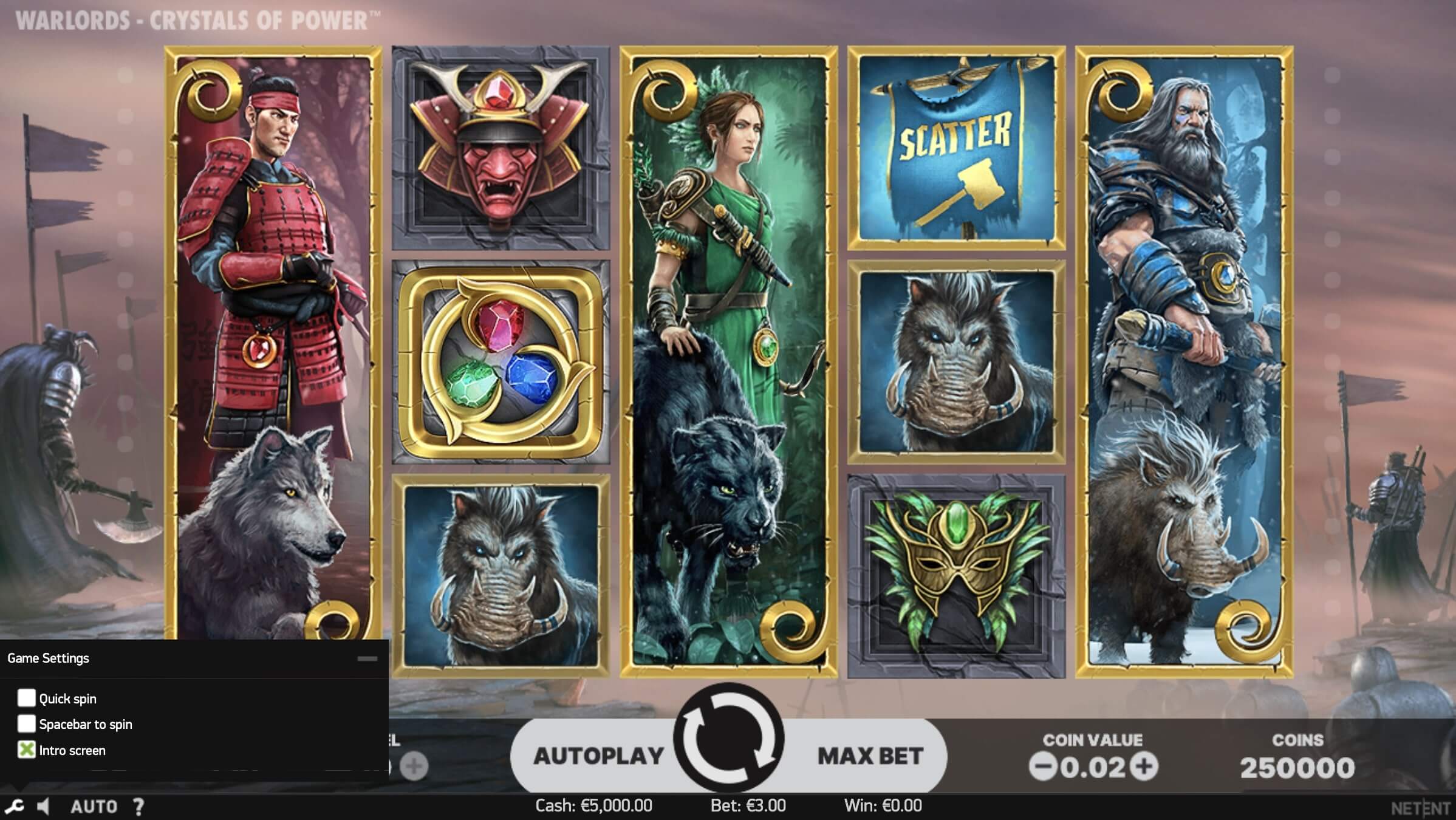
Players can switch between values denominated in coins and in currency either by clicking on any of the three fields or by changing this from the settings menu.
Switching between cash and coin denominations with fictive values
.3
Consolidation of secondary features – The birth of the Game Menu
Observation
Secondary controls although being represented through icons, were tiny and hard to reach in comparison to the rest of the interface.
Assumption
The introduction of a well-organized game menu should improve the user experience and make it easier for players to access all other game functionalities.
Before
Game settings, paytable, and game rules were all represented through tiny icons on the bottom left corner of the main game window.
Old

Redesigned
After
The introduction of a Game Menu concealed all the secondary functionalities within it. Once opened, the menu displays each feature (Paytable, Settings, and Game Rules) in a dedicated vertical tab, with its corresponding content shown on the right side. This design allows for the addition of new features, like Game History, without negatively impacting the user experience due to the menu’s ample size. The order of the functionalities was prioritized according to the results of the survey.
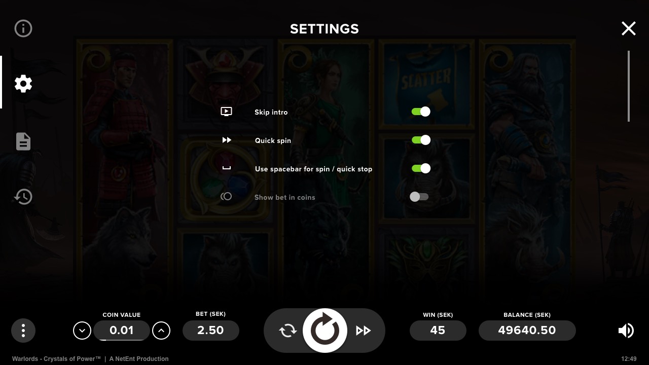
Side-by-side comparison of the Settings menu (Old vs Redesigned)
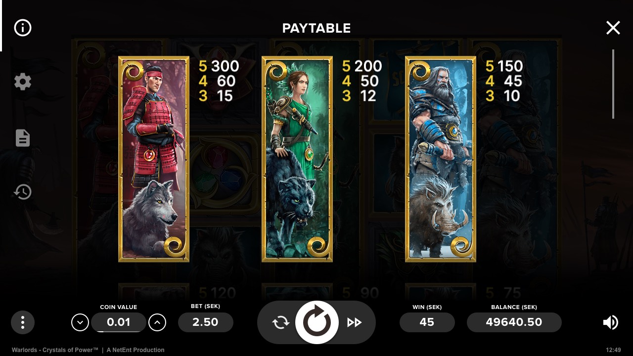
Paytable menu redesigned
.4
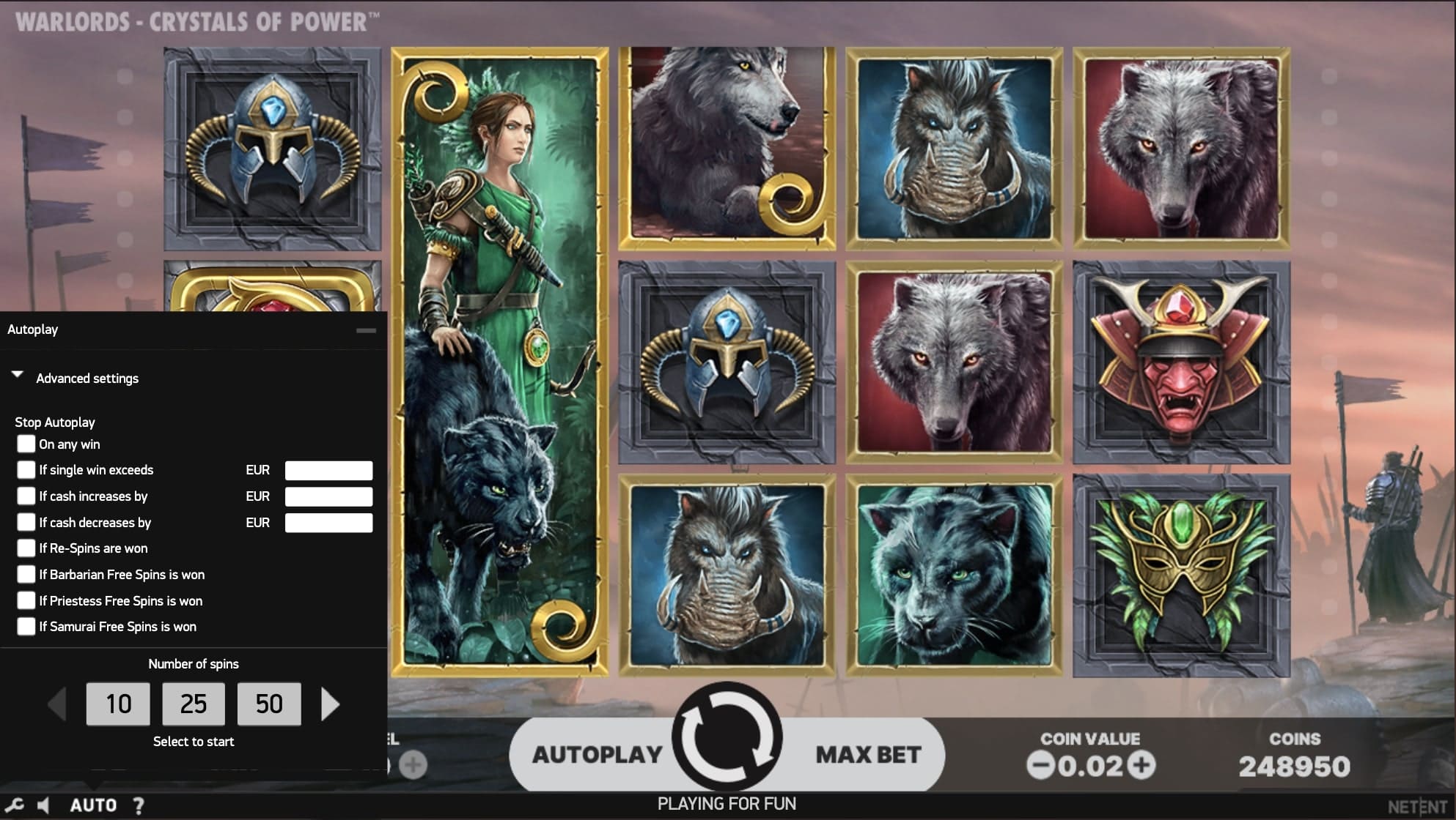
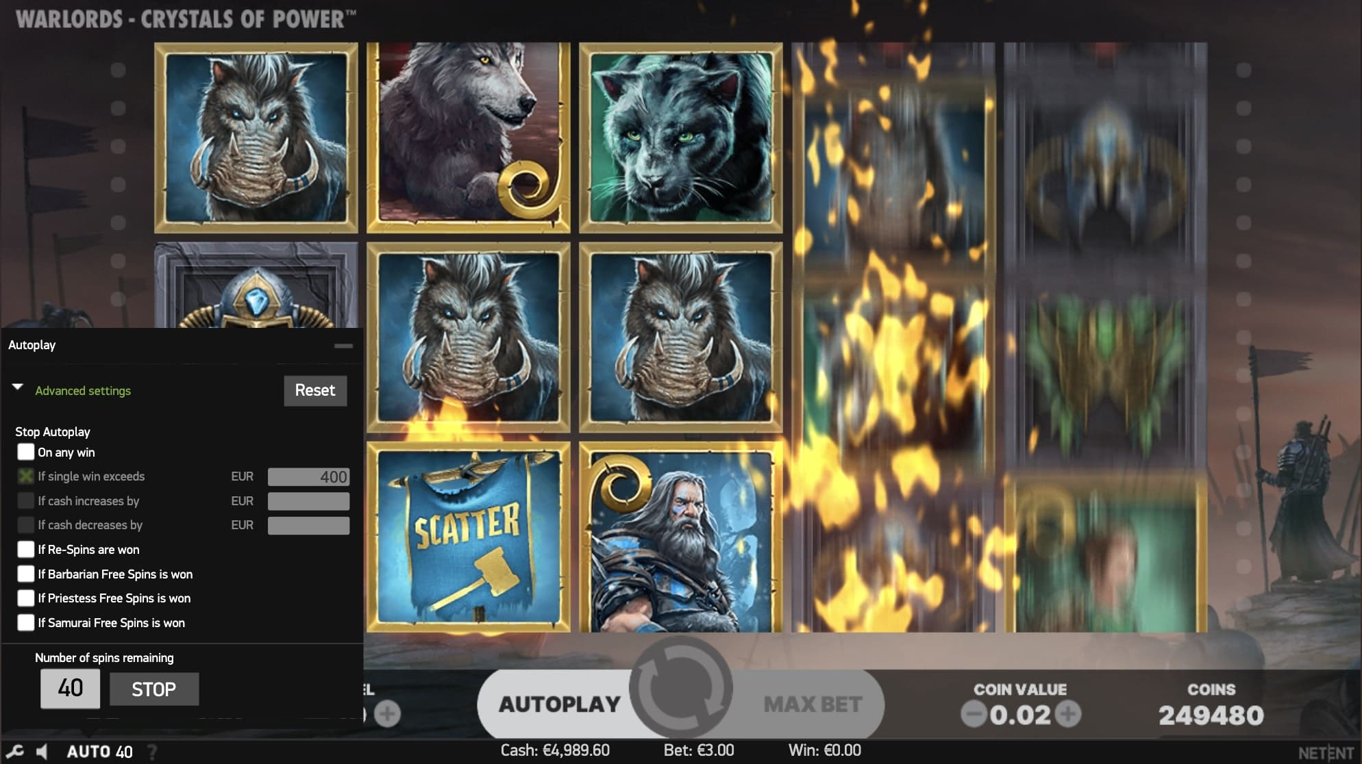
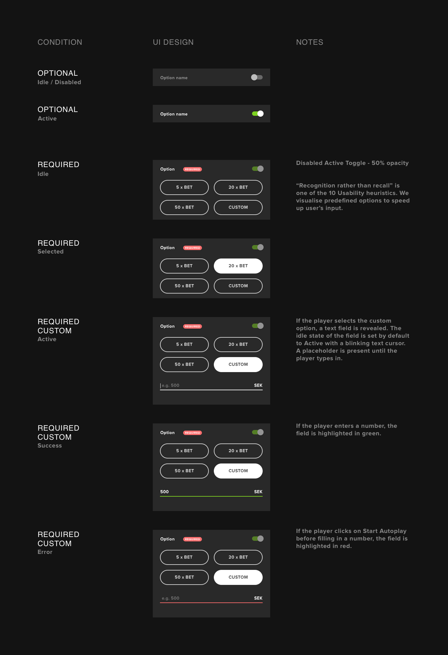
Flexible Autoplay Menu using progressive disclosure
Observation
The current Autoplay implementation covers a portion of the reels throughout all rounds. Apart from being able to check the remaining rounds and manually stopping Autoplay, there is no necessity to keep the menu open continuously.
Assumption
Autoplay controls should be larger and visible only when being configured. They should not cover the reels at any other time. Since the Spin button remains unused during Autoplay, it could be repurposed to include and indicate the Autoplay status.
Before
The Autoplay menu would open at the bottom left corner of the screen and remain there until all rounds had been played. Players had to be careful to set up advanced autoplay before selecting the number of rounds because once they chose the number of autoplay rounds, it would start immediately, which meant they would not be able to reconsider stop conditions or any other advanced options. This would cost them at least one spin at the price of bet size.

Old
After
Similar to the Game menu, Autoplay occupies the entire screen and presents all autoplay options to the user in a single view. Advanced settings, which are infrequently used, are also available for players who require them.
After selecting the number of rounds for Autoplay and configuring advanced settings, the window will minimize and the Spin button will be replaced with a Stop button that displays the number of remaining rounds at the center and gives control to the player to stop the Autoplay at any time.
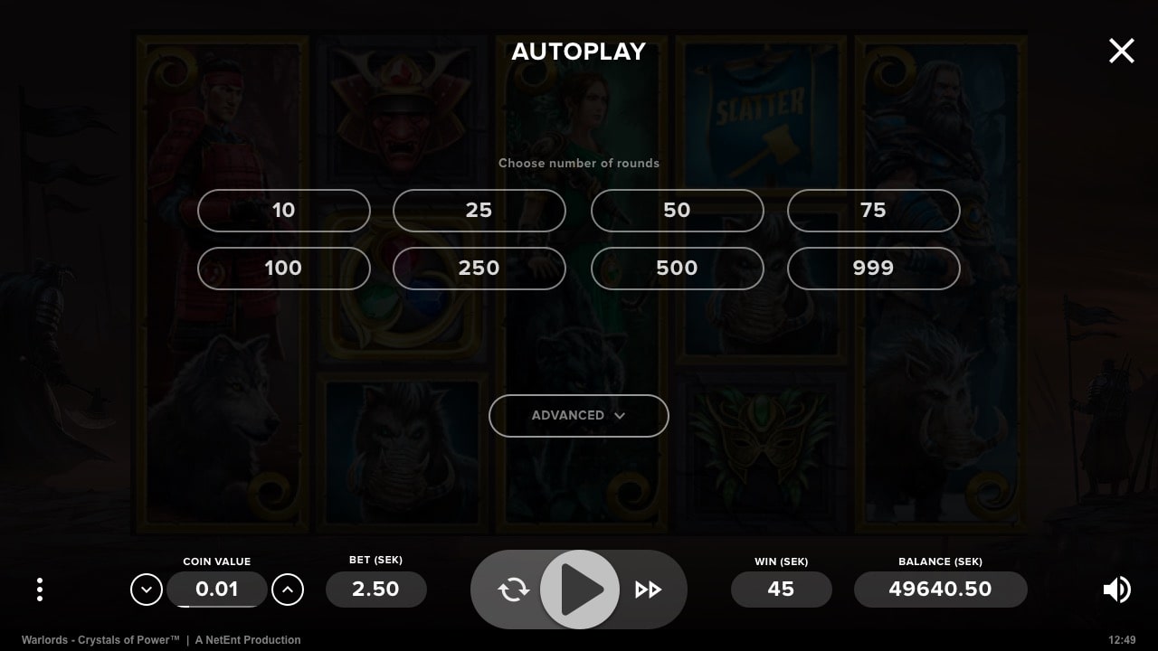
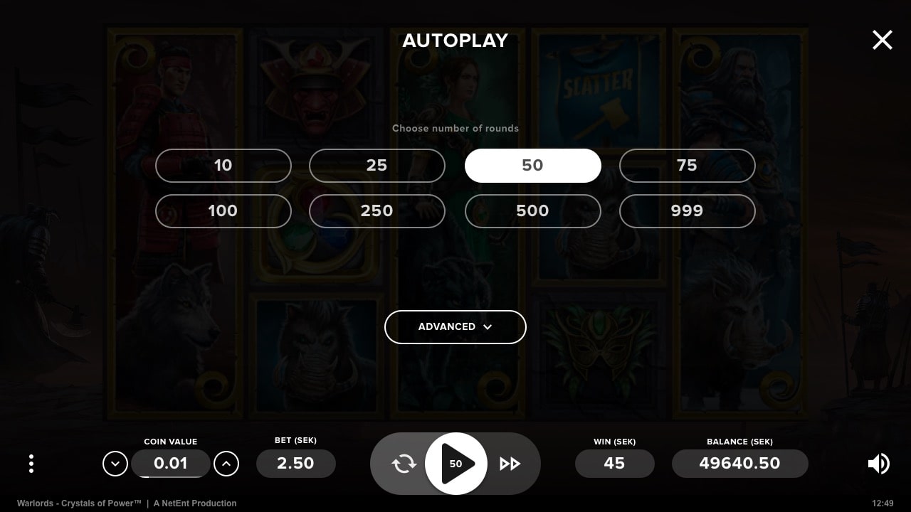
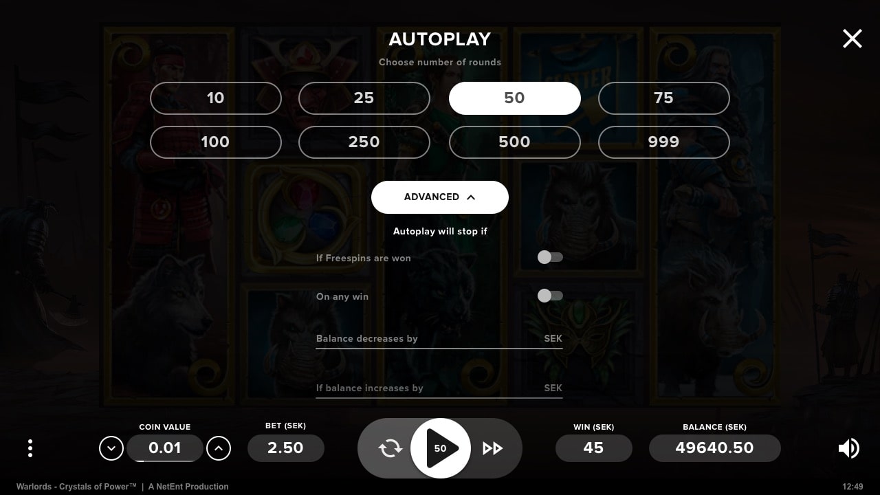

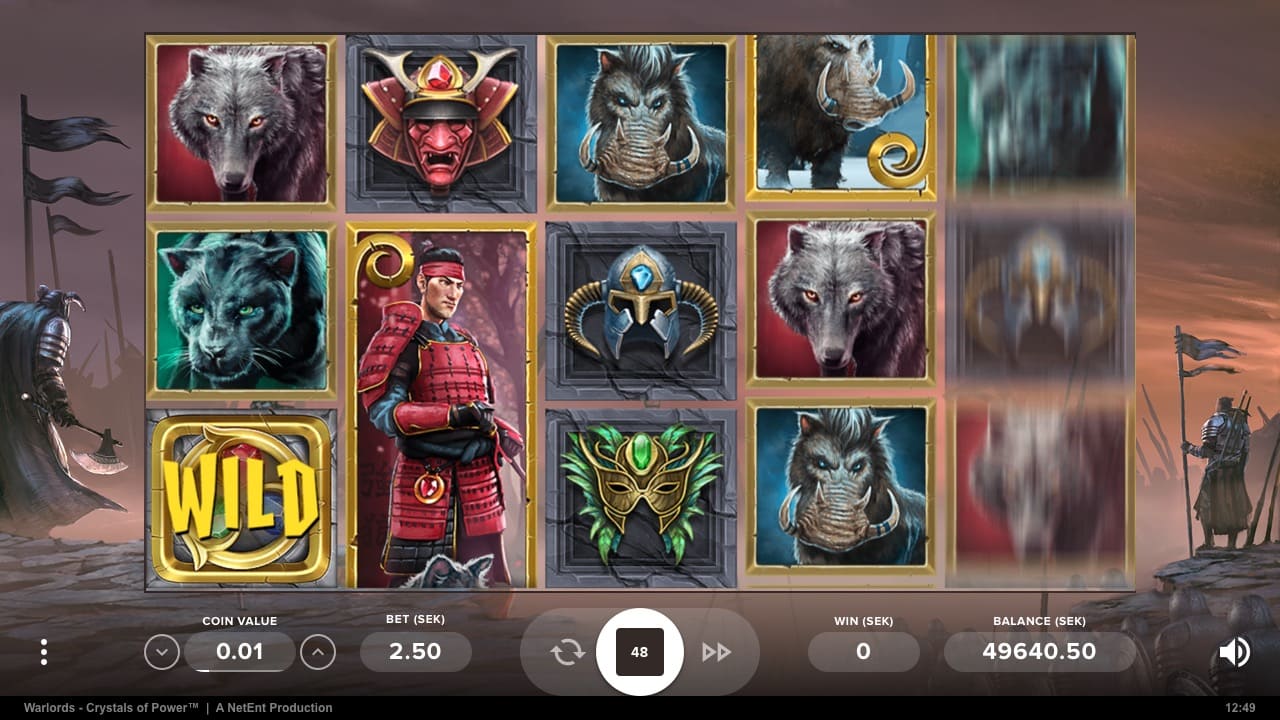
Redesigned
IV.
Visual Design
At the time, Material Design was probably the first complex design language put together that was loud enough to create hype among us – the designers. It inevitably inspired our team to follow some of its classic principles and defined the style and direction for the layout, iconography, components, and interaction patterns.
Layout
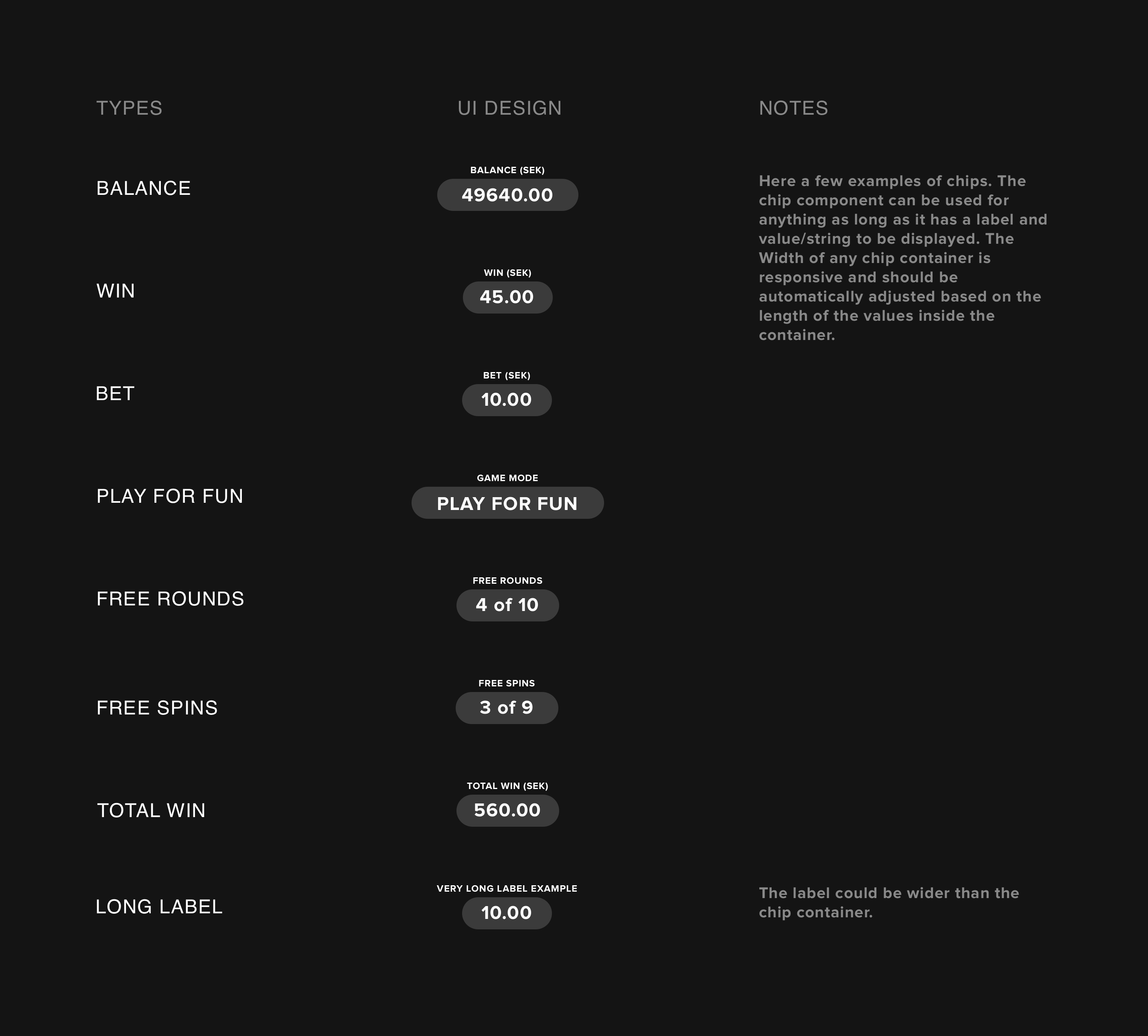
The location of UI elements was mostly kept unchanged to prevent any disruption to the habits of players who are familiar with the NetEnt interface (the only exception – was the relocation of coin value). However, we did choose to align UI elements on an 8pt grid, as outlined in Material Design Language guidelines.
With a grid in place, any element can be scaled as needed. For instance, some currencies display large numbers, such as the Hungarian Forint and the Indonesian Rupiah. The 8pt grid allowed us to scale these elements without affecting any neighboring elements.

Grid examples
Furthermore, the 8pt grid allows us to add more UI elements to the layout, such as buttons for game-specific features, without causing any issues for existing elements. Additionally, it provides support for game modes where the main bar is entirely repurposed, with some key elements completely removed and others introduced, as is the case in Free Spins or Free Rounds.

Examples of reconfiguration of the main bar
Iconography
The iconography consists of icons from the open-source Material Design (MD) Language library. Any missing icons were created according to the guidelines. Each icon is designed to be minimal yet easily readable and clear even at small sizes.”
Examples of iconography
Components
The component library was documented and provided to the development team through InVision, which allowed the development team to access design specifications through the Inspect tool. Inspect allows developers to generate code with a click, gather key information like font names, hex codes, image specs, and dimensions, and more. Therefore, the component specification sheet included the design for each state of the component and some additional notes.

Examples of components spec sheet
Theming
The component library was documented and provided to the development team through InVision, which allowed the development team to access design specifications through the Inspect tool. Inspect allows developers to generate code with a click, gather key information like font names, hex codes, image specs, and dimensions, and more. Therefore, the component specification sheet included the design for each state of the component and some additional notes.

Examples of theming based on game colors
V.
Conclusion
I left NetEnt at the end of October 2018 and I didn’t manage to conduct any tests to validate my redesign assumptions.
However, it seems that NetEnt has implemented and launched the project but made some additional design changes. One of these changes is the reinstatement of the double denomination (coins and cash) in one particular view. Ironically, this validates assumption no. 2: Currency-denominated values are more relevant than coin ones. But you may ask yourself: How does this make sense if it’s the opposite of what you were trying to achieve?
You see, coin balances alone don’t provide players with any meaningful information. Therefore, it’s essential to translate those values into a currency that the players associate with. The re-introduction of double denomination for when the balances are displayed in coins makes sense as it allows players to perceive the value of their game session. However, if the default view presents cash-denominated balances, why would anyone switch to coins? My personal feeling is that this decision has more to do with nostalgia and the older segment of players who associate double denomination with traditional slot machines.”

Screenshots of the actual implementation of PlayUI (2022): Cash vs Coin betting
Other minor changes include the replacement of the Autoplay icon and the removal of the Game History feature. I speculate that the Game History feature may not have been implemented at all, as it may have been deemed too costly or unnecessary for their intentions due to the change of ownership.
Another observation is that NetEnt did not update their older games with PlayUI, but they began using it for their newer games. I suspect that the product roadmap may have been altered or entirely abandoned to align with the vision of the newer stakeholders, following NetEnt’s acquisition by Evolution.
Unfortunately, I’m unable to provide any metrics on the success of the redesign, but I’m happy to see it live.